Wednesday, March 29, 2006
About Me

- Name: Perry Linton Joseph Osuna
- Location: toronto, toronto, Canada
This is for my family. Available for Freelance hpblak@gmail.com
Bloggerism
My LinkedInMy Portfolio Blog
My Portfolio
Linton's Life Drawings
My ArtSlant
Feed The Idiot Box Studio
Linton's 2D Animation Studies
Jody Todoschuk
Lauryn The Lion
Imaginism Studio Blog
Carlos Gonzalves aka GonZ aka the Red Dragon
Santiago Gutierrez
Carlos Baena
The Labyrinth
Chuck Gammage Animation
John Nevarez
Alina Urusov
Brain Wong
Adrien Deggan
Matt Williames
Jason Groh
Cory Wilson
Jean-Sebastien Duclos
Marcelo Vignali
shahab
Jenny
Louis Romano
Braden Poirier
Paul Rivoche
Javier Marti
PunkJazz*Rock
Lautrette
Jeff Shelly
Andrea Blasich
Gabriel Pennacchioli
Mark Andrews
Pat Morgan
Dave James
Hans Ranum
Lucio Alberto Ruiz-Diaz
Bobby Chiu's Subway Sketch Group Blog
Simon Ampel
Character Design
Willy Harber
Kei Acedera
Rob Thompson
Josh Billing
REE
Goreal Da Supreme
Ricardo Laventill
Lucia Vidal
Abdul Rehman
Mel Milton
Ernesto Melo
Serapio Calm
Trev Jimenez
Jeffrey Thompson
Shaz Lym
Andrew Ross
Michael Dedrick
Paul aka Bill
Evan Bonifacio
Martin Wittig
Heath Kenny
Jose Luis Carnes
OneManPunkBand
Andrea Spada
Dave Pimentel
Mark Kennedy
Andre Barnwell
Saxton Moore
Boris Hiestand
Matt Jones
Andrei Riabovitchev
Morgan Kelly
Alessandro Toccaceli
Harald Siepermann
Sam Rowan
Ben Balistreri
Nick Sung
Steve Lambe
Ryan Smith
PAT PAKULA
julien le rolland
Miah Alcorn
BLOGregard Q. Kazoo
alain huynh
Nate Wragg
raul andres
Scott
Noah Klocek
Robh Ruppel
Q7d2
robin joseph
Rob Lilly
Ragnar
shannon
Jakob Jensen
Pascal Campion
Sebastian Krüger
karim Qabrawi
SketchBookAllStars
Raymond Xu
UliMeyer
Ng Kuaushin Airik
Steve
Blogged Artery!!
Frank M Hansen
Insanitay
Taesoo Kim
Craig
James Dylan
Samuel Rapp
Queen Tut
Gavin Ball
Brain Growe
Dan Helle
Uwe Heidschötter


12 Comments:
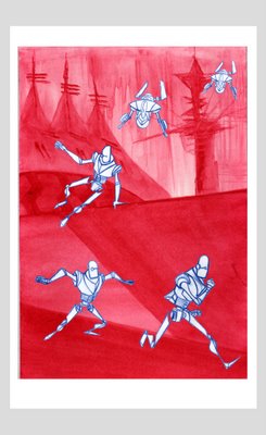
This series of Hunt layout drawings are very cool. I love this one a lot, especially the top piece with characters in action!! Nice to see how you plan out the movement.
loving the monochromatic bg, good job brutha...
the figure is well done too.... everything pops nicely....
Yo, thats hot!!!, and I not just talking about the red background hehe. Is this gonna be an animation? I'm feelin' the robots too!! Good stuff man!
:) Linton this is beautiful :) I totally agree with Alina is nice to see all the scene with the movement :)!!! I love the robot too :)!!! Congrats!!!:)
So whens your animation blog goin live man. True say i hope im right in sayin but I feelin your stuff is lookin ready. But knowing you you wanna get everything down packed, still I cant wait youre gonna have to link me when it goes on still. Til dat day never stop grindin youre an inspiration and motivation to me still.
so much goodness! Really diggin the cold world post Linton. sweet
Very cool layouts.
Love the washy backgrounds!
It's a word. I think.
great new stuff, love the red =]
Love that bottom one! Terrific!
Great man. Love the BG that supports the action . . .sometimes that is forgotten. Great character layout poses too man, nicely done.
MAC
This comment has been removed by a blog administrator.
nice concept here.. and good movement
Post a Comment
<< Home